Wednesday 25 June 2014

Images from the Studio

 We took some images in the studio, some of these images included normal and basic set up for portrait photography (shoulders upwards), however some of these images are different to portraiture, for example we included two people and we found sources around us such as ladders, we some how involved the ladders in the picture to make the image different and more interesting. After we had used the basic set up we decided to use low key lighting to create lots of different shadows. We put the lighting in lots of different places to try out the shadows in different places.


Monday 16 June 2014

Air Brushing

Air Brushing and Why

Air Bushing first started around the 1940's, They used Airbrush to remove certain things in their image that they didn't want to be their, the most common thing they would erase would be people, which eventually develop to smaller details such as removing jewelry and working on there skin such as getting rid of spots and wrinkles. They did this to make their images look better and remove any unwanted things in their images.


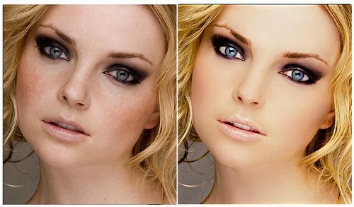
These are some images i found on the internet which are before and afters of airbrushing, as you can see sometimes airbrushing can make you look quite plastic looking and doesn't always make you look better.


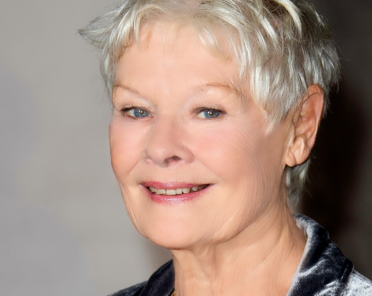
Here are some images i airbrushed my self::


Wednesday 4 June 2014

Duets Food Photography

I like this image because  i think the colours go very well together and none of the colours clash.i also like the angle the photo has been taken at as its high enough to see whats on the plate but not too high or too low.  I like how you can see the reflection in the spoon as it makes the image more interesting and more to look at rather than the food that is on the dish. I also like how you can see the detail on the mat as i think if the mat wasn't in the image i think it would have looked boring.
I like how this image is set out because the image is framed by the napkin, knife and fork. I think this works nicely because it draws attention to the lasagne. I think the red napkin draws more of the red out in the lasagne and looks more colourful than i think it would look quite bland and boring without the napkin. I also like the angle this image has been taken at as i think that it is high enough to see every detail properly. 
I think this image looks a bit blue isn and cold, which means that i should have made sure that the white balance was ok, however i like the angle this image has been taken at as you can see properly what is in the bowl. I like how you can see the detail in the mat as i think it makes the image more interesting if you look at it closely, i also think that the leaf adds more colour to the image as i think the image is quite plain.


I think that this image doesn't have much colour, but by adding the mat it gives the image a bit more to look at rather than a plain bland soup, i also thing the leaf stands out a lot because the soup is quite lifeless. I like the angle this was taken at as you can see almost all of the bread at this angle (top, sides and front) which lets people see the detail in the bread.


i think the tomatoes in this image bring out the yellows and oranges in the jacket potatoes and makes the image more interesting. I also like how you can see the knife and fork as the dish looks well set out. The tomatoes and the cutlery are framing the image which draws the most attention to the potatoes. i like how you can see the detail in the mat and the board. I like how ripe and shiny the tomatoes look to as it brings out the redness in the image.


The first thing that catches my eyes is the reflection in the spoon, i think this adds more detail to the image as it is also creating a reflection on the bowl too. I don't think the red napkin should have been in the image as there isn't any other colours really like it. I like how you can see the detail in the bread which makes the image look a lot more detailed and advanced rather than just a simple image with no detail.