
Wednesday, 2 July 2014
Food Photography Mood Board
Wednesday, 25 June 2014
Images from the Studio


Monday, 16 June 2014
Air Brushing
Air Brushing and Why
Air Bushing first started around the 1940's, They used Airbrush to remove certain things in their image that they didn't want to be their, the most common thing they would erase would be people, which eventually develop to smaller details such as removing jewelry and working on there skin such as getting rid of spots and wrinkles. They did this to make their images look better and remove any unwanted things in their images.

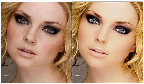
These are some images i found on the internet which are before and afters of airbrushing, as you can see sometimes airbrushing can make you look quite plastic looking and doesn't always make you look better.
Here are some images i airbrushed my self::


Air Bushing first started around the 1940's, They used Airbrush to remove certain things in their image that they didn't want to be their, the most common thing they would erase would be people, which eventually develop to smaller details such as removing jewelry and working on there skin such as getting rid of spots and wrinkles. They did this to make their images look better and remove any unwanted things in their images.
These are some images i found on the internet which are before and afters of airbrushing, as you can see sometimes airbrushing can make you look quite plastic looking and doesn't always make you look better.
Here are some images i airbrushed my self::
Wednesday, 4 June 2014
Duets Food Photography


Wednesday, 14 May 2014
Pack Shot images.


Thursday, 8 May 2014
Health and Safety In the Studio
We had to make a video on health and safety in the studio to show that we understand the dangers and risks working in the studio. In the video we acted out all the bad things that could happen such as wires being on the floor, we then showed what to do instead of having wires on the floor (make sure all wires are out of the way).
Some of the problems we used were touching hot lights, we showed Emily touching the lights and burning her hands, after this problems we showed what do to do instead of burning your hands. (turn the lights ff and let them cool down, or you could use gloves). We also showed lights falling on Emily and showed that lights should be looked at to make sure they are stable at all times. Here is our video with more problems and solutions.
Some of the problems we used were touching hot lights, we showed Emily touching the lights and burning her hands, after this problems we showed what do to do instead of burning your hands. (turn the lights ff and let them cool down, or you could use gloves). We also showed lights falling on Emily and showed that lights should be looked at to make sure they are stable at all times. Here is our video with more problems and solutions.
Client Requirement and Creative Intent
Client Requirement
Client Requirement is just basically what the client needs/wants from a project.
Client Requirement exists because if it didn't then clients wouldn't be able to discuss what they want from a certain topic/project, another reason it exists is because the people in charge of these companies would not be able to listen and find out what the clients want and need, so would not be giving the clients what they want or need as they wouldn't know. An example of a client requirement could be that a man wants to have a photo shoot with his family. Wife, husband(client), son and daughter, however he wants the image to look old and vintage. He would then have to tell the photographer this so that the photographer new the clients requirements.
Creative intent
Creative Intent is were the person creating the project/object has free will over making this and can do what they like, so instead of a client telling the person what they would like to do they leave it to the person to decide what to do. A good example of this could be someone having there photo taken and the photographer can get to whatever angle they want to and make the model do a certain pose of their own choice.
Subscribe to:
Comments (Atom)